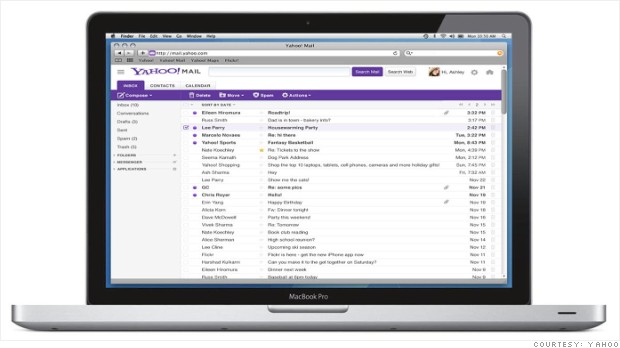
Yahoo on Tuesday rolled out an entire suite of email apps for every major relevant platform: all-new Apple iOS and Windows 8 apps, plus redesigned clients for Android and the Web.
Yahoo once dominated search and email, and it was one of the earliest players in instant messaging and online news aggregation. Then, of course, it all went south. By the time Yahoo lured Mayer away from Google, it was barely even a shell of its former self.
With her hiring came promises to restructure the sprawling company, remake the products, and transform Yahoo into an innovator that can compete with the Googles, Facebooks, Microsofts, Apples and Twitters of the world.
Yahoo Mail general manager Vivek Sharma says Mayer was actively involved in the email revamp.
"She's played an unbelievably pivotal role in product direction and design," Sharma said. "She has an unbelievably intuitive understanding of what users want and need."
The new suite of email apps aren't life changing, but they at least offer a good experience for dedicated Yahoo users and show that the company is aware of what it needs to do to not only hang around, but actually make people care.
Following in the footsteps of Google and Microsoft's recent redesigns of Gmail and Hotmail/Outlook, Yahoo's apps now have a cleaner look, though Yahoo's overall use of color and texture in its user-interface design feels a few years behind what its competitors are doing. A big part of the company's goal was to make its products simpler (there are fewer visible elements and a more intuitive layout) and more consistent across platforms. All of the mobile apps and the Web client now have the same general features and layout.
Among Yahoo's new apps, the iOS app for Apple devices is probably the most modern in look and feel, though much of that comes from the baked-in iOS tools that Google, Twitter and Facebook already use in their apps (including the "pull" gesture to refresh and "swipe" for options). Most importantly: It's fast, renders emails properly, and works offline. One drawback is that it only allows one account at a time to be logged in.
The Web client is also an improvement, with less visual noise and an easier path to firing off emails, but it still looks a generation behind as far as design trends go. Yahoo's Windows 8 app can't help but feel modern since it follows the Windows 8 design language, but -- much like the default Metro email app -- the tragic flaw is that it lacks an expanded view for individual emails. That forces you to view messages in a single corner of the screen.
Merely being good might not cut it. Email is no longer a novel thing, and it's not hard to find better alternatives. Unlike Google and Microsoft , Yahoo lacks a widely used instant messaging service, offers no cloud services, and doesn't have little perks like a "priority inbox" setting.
Sharma says that he hasn't dismissed the value of those features. In addition to looking into developing new clients for other iOS products (read: iPad), the company has its eye on ways to improve the utility of Yahoo Mail, he said.
These apps won't attract an army of converts, but if Yahoo follows through on its promise to treat this as a first step, there may be hope yet for the embattled company. Retweet this story

No comments:
Post a Comment